breathless
Well-known member
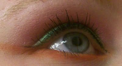
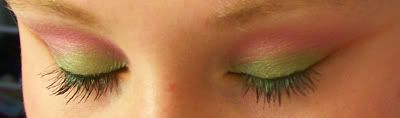
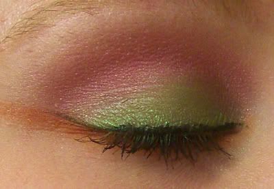
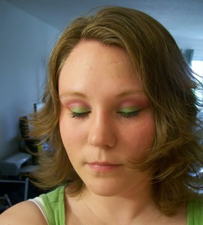
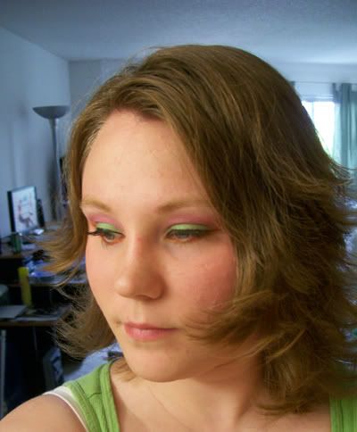
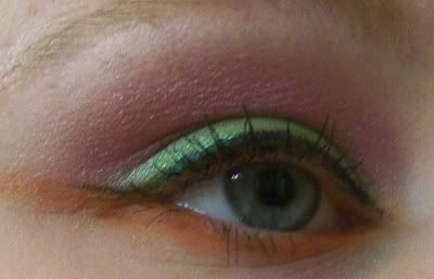
so, today i was feeling pretty bright. chayden [my 9 month old son] was playing with markers. and the colors he picked out was, orange, pink & green. i got really inspired so i looked through my eyeshadow inspiration folder. i didn't find anything with those colors, so i sorta made up my own combo.
well, i do feel as if my blending is getting better. but, not too sure if brights go with my face. it certainly goes with my personality though!
oh. and this was another oppertunity to use liquid liner. my second time ever! i think i did a decent job ... =/
anywho ... i need some constructive critisism & tips.
used:
face;
original chapstick on brows to hold them in place.
the powder in the nyc brow kit.
oceanmist cosmetics mineral powder foundation in sunsilk.
milani blush in luminus.
eyes;
UD PP.
Pure Luxe e/s in jaded. used on whole lid.
L'oreal HIP Pigment in Fiery. used in crease and a bit above. blended down into jaded.
MAC pigment in pink opal. used as browbone highlight. blended down into fiery.
MAC e/s in orange. used as bottom lash liner.
milani liquid liner in black.
maybelline XXL mascara in soft black. used 2 coats.
lips;
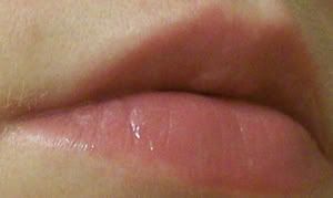
lip smacker lip balm in strawberry watermelon. used at the beginning to make my lips soft.
milani crystal gloss in a light pinkish color. the name rubbed off.

well, i do feel as if my blending is getting better. but, not too sure if brights go with my face. it certainly goes with my personality though!
oh. and this was another oppertunity to use liquid liner. my second time ever! i think i did a decent job ... =/
anywho ... i need some constructive critisism & tips.
used:
face;
original chapstick on brows to hold them in place.
the powder in the nyc brow kit.
oceanmist cosmetics mineral powder foundation in sunsilk.
milani blush in luminus.
eyes;
UD PP.
Pure Luxe e/s in jaded. used on whole lid.
L'oreal HIP Pigment in Fiery. used in crease and a bit above. blended down into jaded.
MAC pigment in pink opal. used as browbone highlight. blended down into fiery.
MAC e/s in orange. used as bottom lash liner.
milani liquid liner in black.
maybelline XXL mascara in soft black. used 2 coats.
lips;
lip smacker lip balm in strawberry watermelon. used at the beginning to make my lips soft.
milani crystal gloss in a light pinkish color. the name rubbed off.
