I need your help deciding my logo!

marusia

Well-known member
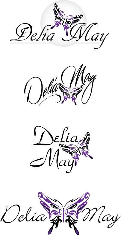
Ok, I ordered this from www.logosafari.com

She's given me some examples to pick from, but I seriously can't even narrow it down to 3! Which do you think would be best for my cosmetics site?
smiles.gif


delia-may.jpg
 

LMD84

Well-known member
the third one down is the best imo. you can easily read the name and the butterfly is large enough but solarge it takes over. fabulous logos but deffo the third one is my fave
smiles.gif
 

bellaxo812

Well-known member
I like the first one and the last one the best. The last one grabs my attention because of the way the butterfly is looking at you. HTH!
 

kaliraksha

Well-known member
The first one is my least favorite. I kind of wish that the second or thirds' font was used for the last one. I really like the butterfly in the middle of the last one, but I wish it were smaller. Picking straight up from all of these, the third is my favorite and seems to have the best balance. It's also the most modern to me.
 

Meisje

Well-known member
The font in the second one is by far the best --- it has personality. I don't really like the arrangement of the butterfly in that one (I would prefer it after the text).

The text in the others is very static.
 

kaylabella

Well-known member
The third one is the most balanced and readable, but I think the type could be tweaked a bit, I'm not a big fan of the massive swooshes are a bit annoying. I'd say it's down to the placement of that one, but you may want to try some different typefaces.
 

panda0410

Well-known member
I like the second one as well - it has a lot more personality than that others, but it IS harder to read.

The 3rd one is easy to read, but its horribly generic, the worst of the 4 IMHO.

The last one is easier to read, but its not balanced, theres way too much focus on the butterfly.

I personally like the second one the best, it has loads more "oomph" than the others, you might want to consider a different typeface or font to make it just a little clearer
winks.gif
 

marusia

Well-known member
I guess I suck at figuring where threads belong. I figured this would be Industry discussion since it's for a Cosmetics site. LOL This is like the 5th time I've had a thread moved in about a week...not sure what I'm doing wrong here.
 

Susanne

Well-known member
Quote:
Originally Posted by marusia
I guess I suck at figuring where threads belong. I figured this would be Industry discussion since it's for a Cosmetics site. LOL This is like the 5th time I've had a thread moved in about a week...not sure what I'm doing wrong here.

th_hug.gif
It is not easy to find the right forum all the time!

I prefer your 3rd logo!
 

ctee80

Member
I like the 2nd one best. I love the font used and I think the butterfly looks like part of the logo as opposed to just being placed in there after the fact. If that makes any sense.
tong.gif
 
Top