You are using an out of date browser. It may not display this or other websites correctly.
You should upgrade or use an alternative browser.
You should upgrade or use an alternative browser.
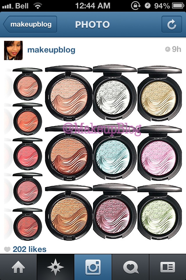
MAC In Extra Dimension Collection 2013 (April 2013)
- Thread starter Mac-Guy
- Start date
We're all whores!I'm a whore too!
erine1881
Well-known member
Yay for us whores!!!We're all whores!
MACina
Well-known member


gildedangel
Well-known member
Is blush whore the new
 ? Wow, I know I've been here for awhile if I remember that lol.
Yay for us whores!!!
erine1881
Well-known member
Must be! :lol:Is blush whore the new :bimbo: ? Wow, I know I've been here for awhile if I remember that lol.
gracie90
Well-known member
I still want everything minus the gold EDSF. But I could be very easily talked into it...Credit to IG user
SydVicious
Well-known member
Don't look at the e/s....Don't look at the e/s..... I am trying to stick to 1 or 2 of the blushes and an EDSF or two and the brushes. I need to avert my eyes from those eyeshadows.Credit to IG user
Anneri
Well-known member
MRV
Well-known member

gracie90
Well-known member
Thanks!
The blushes are


Pinkdollface
Well-known member
I can try to translate it, but I was never that great with GermanWhat does she say?
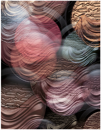
 In the swatch picture the first three are the EDSF (mixed and then the individual colours).
Then she says that the colours are not true to real life in the first picture (the one with the products). The MSF seems more champagne/rosegold in the first picture than it is and in the swatch it looks more true to colour. Bareness is not as light as it is in the first picture and is more beige with some rose tones. Also At Dusk comes across completely different in the first picture compared to real life. Overall the swatches give the best idea, but are not 100% true to real life.
About the blushes: The pigmentation is bad when swatched with fingers, but a lot better with a brush. They do have light pigmentation, but she's ok with that for blushes. On the cheeks they are a dream and they are silky to work with and not powdery at all.
About the skinfinish: This is her first EDSF, so she can't compare it to another one, but she likes it. They didn't have Shape the Future at her counter, but this was her first choice.
About the e/s: The colours were to light she thought. She has swatched two and they seemed more coarse (I'm not sure about this translation) compared to the Glamour Daze ones. And they have the larger pan.
I hope this help a bit. The translation went better than I expected
SydVicious
Well-known member
Danke Pinkdollface! You rock!I can try to translate it, but I was never that great with German
Then she says that the colours are not true to real life in the first picture (the one with the products). The MSF seems more champagne/rosegold in the first picture than it is and in the swatch it looks more true to colour. Bareness is not as light as it is in the first picture and is more beige with some rose tones. Also At Dusk comes across completely different in the first picture compared to real life. Overall the swatches give the best idea, but are not 100% true to real life.
About the blushes: The pigmentation is bad when swatched with fingers, but a lot better with a brush. They do have light pigmentation, but she's ok with that for blushes. On the cheeks they are a dream and they are silky to work with and not powdery at all.
About the skinfinish: This is her first EDSF, so she can't compare it to another one, but she likes it. The didn't have Shape the Future at her counter, but this was her first choice.
About the e/s: The colours were to light she thought. She has swatched two and they seemed more coarse (I'm not sure about this translation) compared to the Glamour Daze ones. And they have the larger pan.
I hope this help a bit. The translation went better than I expected
Anitacska
Well-known member

Aquamarine1543
Well-known member
Based on the swatch, Definitely Defined reminds me of Porcelain pink MSF!
gracie90
Well-known member
T has all the promo pics, and of course everything looks gorgeous!
http://www.temptalia.com/mac-in-extra-dimension-collection-2013-for-springsummer-2013
I like this one especially
http://www.temptalia.com/mac-in-extra-dimension-collection-2013-for-springsummer-2013
I like this one especially
Corally
Well-known member
Crap. Why does Definitely Defined look so good. :shock: It was the EDSF I thought I could easily skip. Then again... is ED-stuff ever easy to skip? Nah. So for now all the EDSF's are on my list again. Don't really like the At Dusk swatch so I think that one goes off the list.. My list: EDSF Double Definition Shape The Future Definitely Defined EDB Bareness Fiery Impact Blazing Heat Though I really hope I can stick to 'only' three blushes and Double Defition EDSF.I can try to translate it, but I was never that great with German