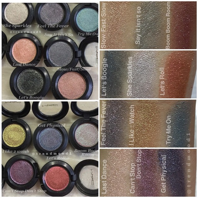
Thing is, these are not what I was expecting from the colourdiscriptions.
Boom Boom Room - Light burgundy with emerald sparkles, I couldn't find an emerald sparkle for the life of me.
Slow/Fast/Slow - Bronze with red sparkles, is that a bronze? Looks more like a wash of pink to me.
Let's Boogie - Black with sparkles, so black with sparkles looks like dark blue with a wash of grey now.
Try Me On - Deep blue green with sparkles, this deep blue green looks a lot like light blue to me.
Feel the Fever - Deep blue purple with pink sparkles, with deep blue they mean a wash of gray again, right?
I Like 2 Watch - Midtone brown with gold sparkles, they must mean straight up gold with this.How is this mid-tone brown?
I get the rest.
Let's Roll - Red bronze with high sparkles, I get this.
Last Dance - Peach beige with pink sparkels, I get this.
She Sparkles - Light grey with silver sparkles, I get this.
Get Physical - Purple with light blue sparkles, I get this.
Say It Isn't So - Dark gray with pink sparkles, I get this
Can't Stop, Don't Stop - Deep plum purple with sparkles, I get this
So half of the colour discriptions didn't made it with what I was expecting. That is better for my wallet because from the colourdiscriptions and the names I wanted it all. Because of the swatches I can just pare that down a lot. I think I am a bit dissapointed with the emerald sparkles missing from Boom Boom Boom. I do strongly agree with what Beauteblogeuer said about these being not as dazzling as I expected. I was thinking dazzling like pressed pigment dazzling and that is nothing like this.
Now I think about it I am very dissapointed that Let's Boogie doesn't look more like Dior's It-Black. I would have loved an eyeshadow that was named Let's Boogie and I would loved an eyeshadow that would look like Dior's It-Black. I can't make this colour of Let's Boogie work and I am not buying it just for the name.

") I'm getting a BU lol
I'm getting a BU lol