Which Eye Looks Better?

kayley123

Well-known member
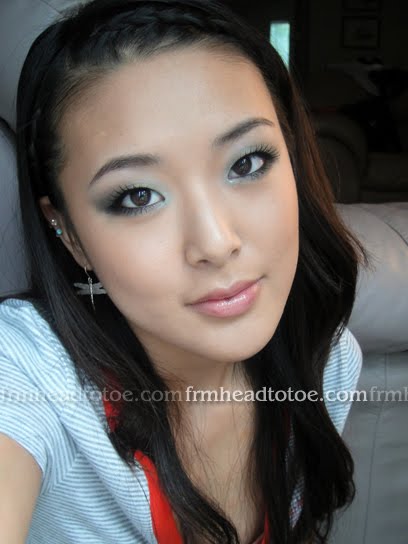
I would love to get some opinions on which eye looks better in these pics--please excuse the state of the rest of my face, and the sloppy application, I'm just starting to get over a sinus infection and wanted to play a little!

On the left in the pic, I have MAC Kid (veluxe) e/s, and on the right, I have MAC LE Crochet (veluxe) e/s. Crochet is darker and cooler, I think. Thanks for opinions, everyone!

EOTD003.jpg

EOTD002.jpg

EOTD001.jpg


In this pic, I put shadow
-On the right: all the way over the lid from outer to inner corner
-On the left, I put it on the outer corner/outer 1/3 or 1/2 and a little under the lower lash line.
*If the 2nd pic shows up HUGE, please try refreshing, for some reason, even though I resized it in my photobucket, it occasionally still comes up as the larger size...*
Random009.jpg
Random010.jpg


Also, I wondered (if you're not tired of looking at my face) if this e/s looks good or weird. This is with some natural light from the window, and then with the flash, to show how sparkly it is. It's Jill Stuart Jelly Eye Color N in 04 Mint Sorbet.
005.jpg

007.jpg

006.jpg

008.jpg
 

lechat

Active member
The right looks better to me.

For the bottom shadow, I think it'd also be really pretty with a darker colour blended in on the side, as well as blending it a bit smoother towards the brow.
 

Sojourner

Well-known member
Definitely the one on the right because it looks sultry and like you intended it to look that way. To an untrained eye the one on the left might just look like darker skin on the eyelids i.e you can't quite tell it's eyeshadow.

The second pics with the minty eyeshadow, I agree that it would look better with a darker colour, like a dark blue or brown like the Crochet you are wearing in the first pic ...generally speaking I dislike those frosty shimmery pastel colours on myself, they look a bit high school makeup on me but maybe that's due to my bad blending skills...I hope you don't mind me saying
smiles.gif
 

kayley123

Well-known member
Quote:
Originally Posted by Sojourner
Definitely the one on the right because it looks sultry and like you intended it to look that way. To an untrained eye the one on the left might just look like darker skin on the eyelids i.e you can't quite tell it's eyeshadow.

The second pics with the minty eyeshadow, I agree that it would look better with a darker colour, like a dark blue or brown like the Crochet you are wearing in the first pic ...generally speaking I dislike those frosty shimmery pastel colours on myself, they look a bit high school makeup on me but maybe that's due to my bad blending skills...I hope you don't mind me saying
smiles.gif


Heh I see what you mean, I don't mind you saying it at all--I'd rather have somebody tell me if something looks bad/off, rather than wearing it out and feeling weird.
winkiss.gif
I didn't really do any blending since I was trying to get the minty color to show, but I probably should have.
What do you think of the middle set of pics?
 

kayley123

Well-known member
Quote:
Originally Posted by lechat
The right looks better to me.

For the bottom shadow, I think it'd also be really pretty with a darker colour blended in on the side, as well as blending it a bit smoother towards the brow.


Maybe do what I did in the 2nd set of pics on the left eye (outer corner/lower lashline), with the green already on?
 

lechat

Active member
Quote:
Originally Posted by kayley123
Maybe do what I did in the 2nd set of pics on the left eye (outer corner/lower lashline), with the green already on?

I think the main thing is that you just need to add more dimension. Monolids look so gorgeous to me, but I think the key to making them look their best is to tone down some of the flatness.

The look here, done with the colours you already have, would be really nice:
From Head To Toe: Smokey Eyes Tutorial for Monolids or Single Lids
singlesmokey3.jpg


Now that you mention green, a nice greengreen shadow would be really pretty with your skin tone!
 

Sojourner

Well-known member
Quote:
Originally Posted by kayley123
What do you think of the middle set of pics?

Oops I forgot to comment on those , I like the right side better, I'm not sure I can explain why though
tong.gif
It just looks more attractive when there is colour all over the lid IMO...
 

xjslx

Well-known member
I think Crochet looks better on you than Kid
smiles.gif


Also, to be completely honest, the Jill Stuart jelly does look a bit off... it seems a bit too bright & sparkly, not in a mature way though.

Hope this helps!
 
Top