You are using an out of date browser. It may not display this or other websites correctly.
You should upgrade or use an alternative browser.
You should upgrade or use an alternative browser.
MAC and Gareth Pugh Discussion
- Thread starter LMD84
- Start date
i actually have that shadow from ud *(in fact i think i have two of them!) but still want deceit!I figured it out! Deceit reminds me of Urban Decay's Rockstar eye shadow. (Not sure if someone already said this.)
If you have an UD palette with Rockstar in it, maybe you can skip Deceit.
 there is something wrong with me- i'm an addict!
HoneyMilk
Well-known member
I absolutely hate the packaging. HATE.
I'm sorry, but I expected much more from someone "in the biz".
It looks like something a first year art student created... couture? Please. More like, "I rushed my butt through this." Just because it has Gareth Pugh's name on it shouldn't automatically make it all-knowing and holy. If anything, I expect so much more for the price tag. I also think the imprint on the powders and the print on the boxes is beyond stupid as well. It would literally take 5 minutes to create something like this in illustrator or PS.
The only items I am digging are the l/g... n/p is a disappointment. I like the concepts behind the actual products though.. just... the packaging.. REALLY? a single bar with his name on it? some triangles?
Mac-Guy
Well-known member
Well, GP is really into geometric shapes. While the concept might seem to be simple, it has certainly a classic appeal that will last a long time. Of course, taste is debatable. Personally, I enjoy that the design is rather clean and it goes very well with the overall design aesthetic of GP.I absolutely hate the packaging. HATE.
I'm sorry, but I expected much more from someone "in the biz".
It looks like something a first year art student created... couture? Please. More like, "I rushed my butt through this." Just because it has Gareth Pugh's name on it shouldn't automatically make it all-knowing and holy. If anything, I expect so much more for the price tag. I also think the imprint on the powders and the print on the boxes is beyond stupid as well. It would literally take 5 minutes to create something like this in illustrator or PS.
The only items I am digging are the l/g... n/p is a disappointment. I like the concepts behind the actual products though.. just... the packaging.. REALLY? a single bar with his name on it? some triangles?
Mac-Guy
Well-known member
I agree it goes with his design, but if you saw the packaging without his name on it, I doubt that it's unique enough that someone would say, "Gareth Pugh!"
I don't hate the guy.. just this launch
I dunno... I woke up crabbyand opinionated..
Agreed, but that probably goes for most design. Over the years, my own design aesthetic moved from very elaborated to a more simple design, and now I feel being simple is much more complicated than being elaborate. I think a design historian might well see the GP collection and read "GP," but those who are unfamiliar with GP's work will certainly not recognize it as GP. I've been following GP's design over the past few years and I am always surprised how he pulls off to use similar geometric shapes in new ways. As his collections are mostly black/white, the use of shape is even more important in his work. The most interesting to me are the compacts. I agree that the l/s design is not very unusual, especially as we have seen similar shapes in the past.
martiangurll
Well-known member
Do we think Circa Plum over a darker purple or black base would approximate Deceit closely enough to prevent a wallet hemorrhage? I just can't get over the tiny amount in the tiny but very cute geometric jar, for the increased price. What if I tried Circa Plum or Mauvement over SharkSkin or Blackground? How about Bloodline piggie over those bases? Or, are we closer to Moth Brown layered over Nice Vice? Would any of these combos take me close enough???
katred
Specktra Bestie
I too am not getting much but love the collection as a whole. It's a gorgeous edgy beautiful collection. Vacant does look simular to Docile, but is more lavender than pink. Plus my Docile went bad so Vacant is perfect! It's so strange, my Docile smells and tastes weird. I have had glosses longer than it, but are still good. Dunno what happened. :-(
Katred you look stunning as ever! Would you say Outrage is a must have? I'm considering that one now. It's so cool looking! Plus I'm considering the nude lipstick, only prob is I have a prob with really pale lippies looking to dry on me, and shows all my lip imperfections.
Thanks! I don't know if I'd say it's a must, but it is really nice. The shimmer is less obvious on the lips than I'd like it to be, although it's still there. And the base colour is really pretty. So, yes, I do really recommend it, more than any of the other products. It is kind of close to Date Night dazzleglass, although the shimmer is different. I don't know if you'd need both. (Although, if I had to choose between them, I'd pick Outrage.)
Allura Beauty
Well-known member
Not sure, but yesterday I was thinking about doing some combos to see how close they'd get. I'll post pictures tonight if any of them come close.Do we think Circa Plum over a darker purple or black base would approximate Deceit closely enough to prevent a wallet hemorrhage? I just can't get over the tiny amount in the tiny but very cute geometric jar, for the increased price. What if I tried Circa Plum or Mauvement over SharkSkin or Blackground? How about Bloodline piggie over those bases? Or, are we closer to Moth Brown layered over Nice Vice? Would any of these combos take me close enough???
ahoythere
Well-known member
I feel like I need to see more swatches, but If I just look at Temptalia's I would say that Nocturnal Plum + Maroon pigment would get you exactly Deceit. Alternately perhaps Smoke Signals + Bloodline + Heritage Rouge? Smoke Signals + Deep Purple?
I think I am talking myself into a low shimmer-burgundy look for tomorrow.......MAN I love pigments!

I think I am talking myself into a low shimmer-burgundy look for tomorrow.......MAN I love pigments!
Do we think Circa Plum over a darker purple or black base would approximate Deceit closely enough to prevent a wallet hemorrhage? I just can't get over the tiny amount in the tiny but very cute geometric jar, for the increased price. What if I tried Circa Plum or Mauvement over SharkSkin or Blackground? How about Bloodline piggie over those bases? Or, are we closer to Moth Brown layered over Nice Vice? Would any of these combos take me close enough???
Prettypackages
Well-known member
I actually loved that quite cute quad. I might wear it tonite when I go out.
I like the movement towards a "washed-out", softer vampy look too and am really glad MAC is spearheading this trend and supporting it through multiple collections - that's actually the interesting thing about Glitter & Ice....colors like Hold That Pose, Winterized and Soft Sable are great for that look. People were really scratching their heads over that Quite Cute quad, but here we are many months later and it's starting to sink in.
Of course that means that by next holiday, the raccoon eyes will be back in style, huh?
xasperadastra
Well-known member
I have a strange question: if for example I have strada in the gareth pugh packaging and I finish it... can insert a rounded refill inside or is it too small?? XDXDXD I know, it's weird..
Prettypackages
Well-known member
beautiful, what are you wearing on your eyes?
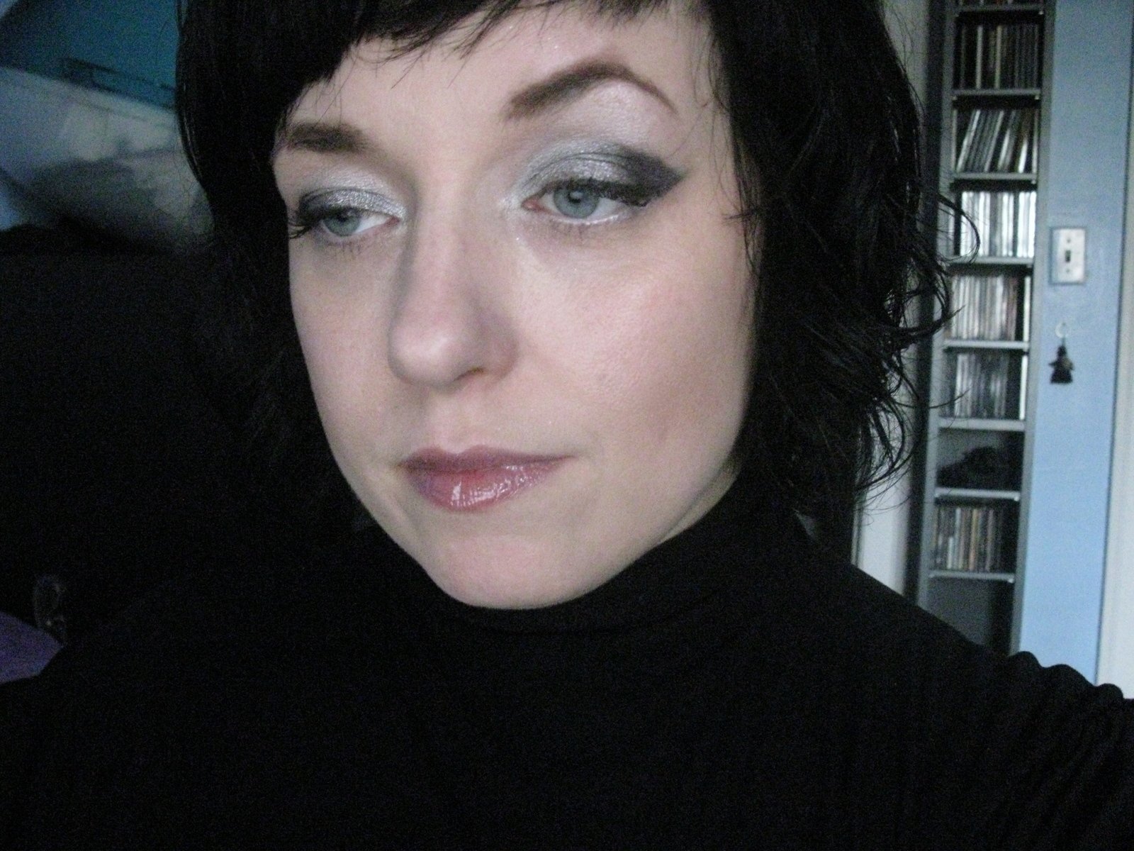
I posted a couple of pics in the swatch thread- Outrage and Strada. I'm wearing both today in a Gareth Pugh-inspired look. I do love the shades for this collection, even if I don't feel the need to buy a lot of the products.
Here's Outrage and Strada on me:

i'm guessing because people have said this contains less product that the actual pan is going to be smaller... but i could be wrong!I have a strange question: if for example I have strada in the gareth pugh packaging and I finish it... can insert a rounded refill inside or is it too small?? XDXDXD I know, it's weird..
MAC Shimmermint Eyeshadow - todays specktra blog post
katred
Specktra Bestie
Although I don't think that the review covers anything I haven't already said here, I posted my thoughts on GP on my blog. You can also see the details of the look I posted, if you're interested:
http://morelikespace.blogspot.com/2011/11/making-faces-pugh-pugh-pugh.html
http://morelikespace.blogspot.com/2011/11/making-faces-pugh-pugh-pugh.html
Richelle83
Well-known member
Although I don't think that the review covers anything I haven't already said here, I posted my thoughts on GP on my blog. You can also see the details of the look I posted, if you're interested:
http://morelikespace.blogspot.com/2011/11/making-faces-pugh-pugh-pugh.html
The kitteh!!! I swear everything looks fabulous on you!
katred
Specktra Bestie
have we seen any metal x pics yet...
sorry i have gone back and forth and cant seem to find!
It doesn't look like any of the stores have received them so far...
princess sarah
Well-known member
I have only seen that 1 on here, im an NW20 and a rather pale one that that with a few freckles. I keep googling but i cant find alot of swatches out there from this collection and its rather irritating me.