You are using an out of date browser. It may not display this or other websites correctly.
You should upgrade or use an alternative browser.
You should upgrade or use an alternative browser.
MAC x Proenza Schouler (April 24, 2014)
- Thread starter LastContrast
- Start date
OctoberViolet
Well-known member
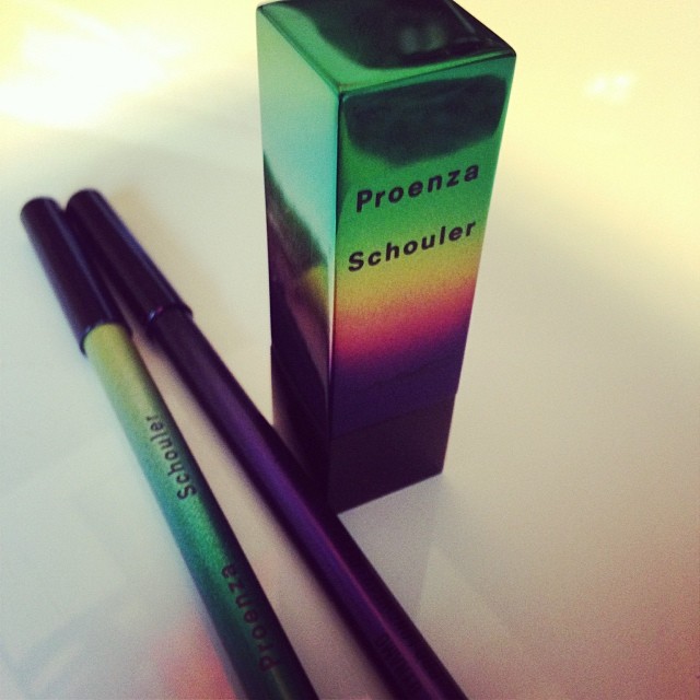
Thank you, Nadine! I like the packaging. Now I just want the color story! Goodness MAC! Come on. Give us something.
SassClassBeauty
Well-known member
Based on what we have seen I'll probably snag the lippies and the blushes. I don't know why but I can't get onboard with MAC lacquers are they really better than say OPI, Julep, ect.?
I may be interested in the pencils, but I need swatches for that

I may be interested in the pencils, but I need swatches for that
matchachoco
Well-known member
On the whole, no. There are some good MAC polishes but there are a lot of misses and I'd say brands like OPI and Zoya (my fave) are more consistent. Also, MAC polish brushes are not my favorites. The bristles are so stiff!Based on what we have seen I'll probably snag the lippies and the blushes. I don't know why but I can't get onboard with MAC lacquers are they really better than say OPI, Julep, etc.?
SassClassBeauty
Well-known member
LOVE Zoya. My faves are Lola and Robyn and wouldn't you know they look super cute together. Thanks for the heads up. I'm glad I have never bought any then. For a split second I was concerned maybe I was missing out on something spectacular..On the whole, no. There are some good MAC polishes but there are a lot of misses and I'd say brands like OPI and Zoya (my fave) are more consistent. Also, MAC polish brushes are not my favorites. The bristles are so stiff!
NaomiH
Well-known member
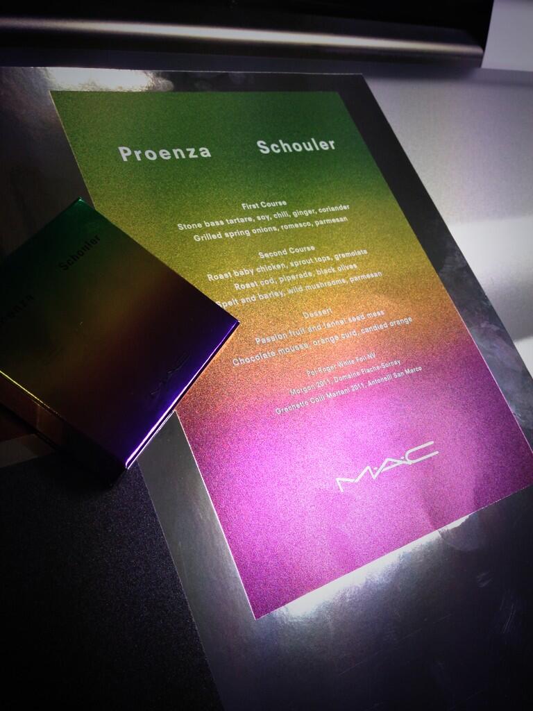
I'm glad I'm not the only one not digging the font! Everything else about it is cool but that font......That Times New Roman (or whatever it is) font is just ruining it!
Yeah, it bugs me as well!That Times New Roman (or whatever it is) font is just ruining it!

Spectacular
Well-known member
The font looks like the kind of thing you usually see on counterfeit products. Wonder why they went with that.
Thanks for the pictures Naynadine!
Thanks for the pictures Naynadine!
Beautybuyer
Well-known member
Lol it really does! Like someone just typed it up!The font looks like the kind of thing you usually see on counterfeit products. Wonder why they went with that. Thanks for the pictures Naynadine!
NaomiH
Well-known member
Throws the entire look off!
The font looks like the kind of thing you usually see on counterfeit products. Wonder why they went with that. Thanks for the pictures Naynadine!
texasmommy
Well-known member
lol, El Paso is my hometown, born and raised! I live in central TX now, but I will always gladly claim itIDK if the rest of Texas claims us though lol. We are a a lot different out there!
")
KrystalAnne
Well-known member
Yeah, it's funky. Looks like it was the easiest thing for them to throw on it.Throws the entire look off!
NewChick10
Well-known member
The lipstick packaging reminds me of the L'oreal Color Riche.
miss0annette
Well-known member
That Times New Roman (or whatever it is) font is just ruining it!
Yes! Take that awful font off and we're good.Yeah, it bugs me as well! :aargh: Logo would have been way nicer.
allthingsmakeup
Well-known member
Thanks Naynadine!
@first I did not like the packaging at all but seeing it from this angle I think I am actually start to like it.
@first I did not like the packaging at all but seeing it from this angle I think I am actually start to like it.
LiliV
Well-known member
I agree it makes it look like something you'd make on Microsoft Paint in 1998 rather than modern or coolThat Times New Roman (or whatever it is) font is just ruining it!