Well... I got a bit more than I thought I would. I seriously think that I'd convinced myself everything would be so lame that when I saw it in person, I was sort of pleasantly surprised. I said I was going to get Sun Blonde and Hibiscus. I ended up with:
Sun Blonde
Surf USA
Swell Baby
Hibiscus
Bust Out
My Paradise
Yeah, I even ended up with the blush I thought I was over. It's just that after anticipating it being really orange, it turned out to be a really pretty peach on my pink-undertoned skin. Gosh darn it to heck.
Sun Blonde is exactly what I wanted... I sort of see why people have compared it to Gorgeous Gold even though the colours are very different. There is something about the effect- the sheen that gives it a different look- that does link them. I can't wait to try them together.
Swell Baby is gorgeous! It's nothing like the perm colour Print, which I have and HATE. Print has crappy colour payoff and almost always looks muddy, plus it's incredibly uneven when applied. Swell Baby is much warmer and has a lovely, slightly warm sheen. The pigmentation is rich (as it is with all of the shadows) and it's a much warmer grey than print. It's lighter than Copperplate and the sheen differentiates the two- I think they could work really well together.
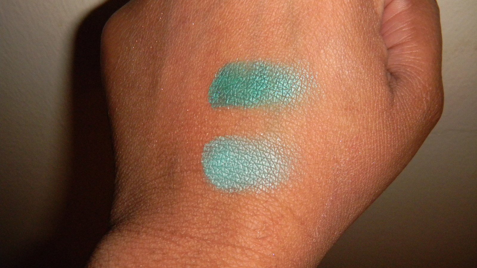
Surf USA- Incredibly rich. I showed The Great Enabler and even he was shocked at the intensity and richness of the colour. Most teals I have are much more blue than this one- this one has lots of green. A no-brainer for teal lovers and really a necessity for anyone who likes bright colours.
Bust Out- I was actually pleasantly surprised by this. Mac have released a whole lot of mid-tone purples recently (Spitfire, Quite the Thing, Play Time, Style Curve), but I feel that this one is what they were aiming for all along. It's purple rather than pink (unlike Style Curve and Spitfire)... It's not a blue purple like Go For It, but it definitely has its place. I agree with the review that described this as "dirty" (I'm sorry, I can't remember who said it, I believe it was Pink Basset). Up the Amp is more mauve rather than purple and Rebel is much more pink. I'll put up some swatches as soon as I can. (Note- won't be before Saturday, because I have to take a couple of little gentlemen in to the vet tomorrow)
Hibiscus- First swatch, I thought it was indistinguishable from Toxic Tale. It's very even and opaque for a cremesheen (I usually find that a little of my lip peeks through for most CS lipsticks). On the lips, though, the redness comes through much more. TT looks more orange and a bit cooler (insofar as orange can ever be "cool"), whereas this is a warm coral-red. Me likey.
I felt like Naturally Eccentric is something that they could have sold me- a cool analogue to Creme d'Nude- if they'd tried. As it stands, it was incredibly uneven and felt, I kid you not , GRITTY when I tried it on. Ick.
Mocha is Mocha. It never works on me, but on warmer skin tones, I'll bet it's lovely.
Of the glosses, only Krazy Kahuna seemed worth noting, honestly (Strange Potion really doesn't work on me). KK is gorgeous and smooth and pigmented and if I didn't already have a tube of Temper Tantra that I still haven't used, it would have been mine for sure.
My MA insisted I take home a sample of one of the crushed metal pigments... So he gave me a bit of the gold one. I have to say, I'm pretty impressed. It's much smoother and easier to work with than I expected... Oh no...
The bronzers and lip balms don't interest me in the least, so I seriously didn't even look at that half of the display.
More info when I have more time. I'll just be happy if I can post this, because the power has gone off twice on me already...

") lol
lol
